Hello, I’m Jeremy DeVos, a UX designer based out of Grand Rapids, MI. I specialize in graphic design and user research.
CLC Website
Modernization Project
MY ROLE:
UX DESIGNER
DURATION:
4 WEEKS

Project Overview
Client Needs: A conductive learning charity needed to modernize its website to give users a better experience and gain volunteers and donations.
Solution: A total overhaul of their site design to bring it into line with modern trends, address accessiblity issues, and increase engagement.
Client
Conductive Learning Center
Year
4/01/2023
Audience
CLC site visitors, volunteers, donors
Team Mates
Thinkful Support Team
My Contributions
User Research, Wireframing, Usability Testing
Impact
1. Created a modernized site interface to explain CLC’s mission to site visitors and drive donations and volunteers
2. Increased month to month donations by 18%
3. Increased average monthly volunteers by 32
Client Meeting
I had previous work experience with CLC, so I was able to get in contact with them without much issue. I noted that their site had issues and they agreed with me.
They wanted to redesign their site for a long time, but they did not have the resources or expertise that they needed to modernize the design.
During the course of the meeting we laid out 3 main goals:
Drive engagement
Modernize and meet accessiblity standards
Streamline the volunteer and donation process
Once we had worked out the details and receieved some media resources from the client, I set out to do research to discover the solutions to their problems.
Research and Analysis
Research Methods Used: Persona Development, Competitive analysis, User Surveys, User Interviews
Research Period: 2 Weeks
Competitive Analysis
-
Conductive Education Center of Orlando
Strengths: Strong design fundamentals, Steamlined site design
Weaknesses: To much text & too long winded in some cases
Oppportunities: Keep text and explanations to a minimum
-
ConductMe
Strengths: Good logo, very informative
Weaknesses: Too much text, lack of engaging visual elements
Opportunities: Gamifications and elements that drive engagement
-
World Wildlife Fund
Strengths: Good design fundamentals, concise
Weaknesses: Accessibility issues (text too small)
Opportunities: Emphasize accessibility in our design

User Personas
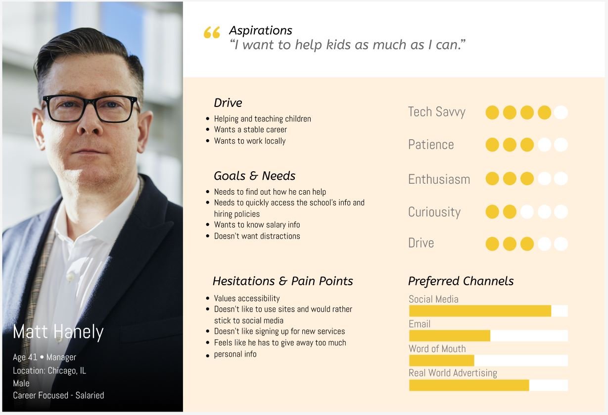
Matt Hanely
Age 41 - Manager
Terry Shoemaker
Age 29 - Accountant
Persona Development: 3 Different personas based on the types of people most likely to donate and volunteer to a charitable organization that helps children with disabilities
Key Motivations: Helping children, putting money towards a good cause, being an educator
Key Frustrations: Trust in organizations, working through the process to donate/volunteer
Pain Points: Info volume, navigation frustrations, time and money commitment
With the personas, we found traits that all potential users had in common. People who donate to charities like CLC are likely to have disposable income, have time to research charities, and want to make an impact with their money. Some users were educators and wanted to put their skills to good use by volunteering. There were users who had children with wanted to know about the organization before they enrolled them.

User Stories
During the development of the personas, I created user stories to address the most important points that the new site design needed to take into account.
User Flows
Working with the design, I created user flows to map out how to best create the best website.
Brand Personality
CLC was meant to represent a beacon of hope for parents with children who suffered from nervous system issues like cerebral palsy. This project was different from usual because CLC’s brand had already been established by the client. Never the less, I found ways to build on the ideas that they had established.
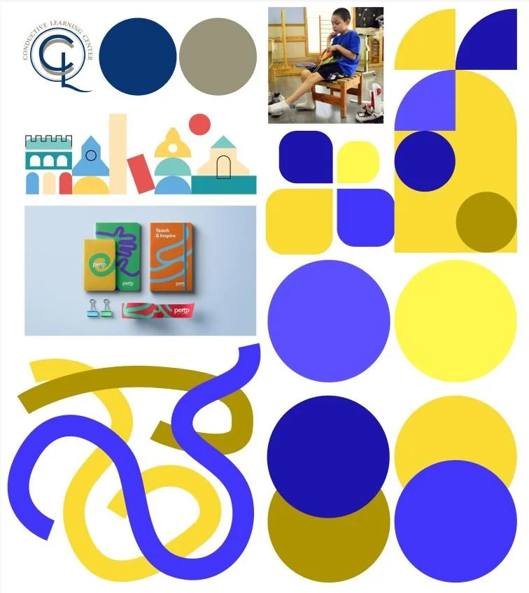
Moodboard
Once the user experience had been laid out, it was time to start working on the overall style for the redesign. The client wanted to keep using the same logo, so I focused on developing a new color palette for the site.
Style Guide
A style guide had to be established for the typography and ideas going into the design.
Work on the wireframes began after initial research was completed. The design had to allow users to find out about CLC’s mission, and make donating and volunterring a painless process.
Wireframes & Prototypes
After the sketches were completed, I began work on the wireframes. The wireframes went smoothly because of the strong sketches that I put together earlier in the project.
I laid out the pages and features in order to see what would work. This is where I decided to add a gamified UI element for donations to allow users to see how much they are giving away and if they qualify for a free gift.
The prototype phase took a lot of testing and revision. The site was one of the more ambitious project that I had put together in Figma, and it required a lot of back-and-forth to put together.
The Client Was Satisfied With the prototype that I had put together. The agreed that it was the roadmap to a more modernized and successful version of their online presense. I will work with them at a later time to finalize the project.
Conclusion
The Prototype Was Successful Because of the effort put into making sketches of all of the desired features and hashing out exactly what was needed before work began on the official prototype.
Challenges During the Design Phase Mostly involved grappling with the prototype’s functionality and making sure all of the elements worked, or at least made their functionality clear during the prototype testing.


